Why Should Responsive Web Design Matter To Small Business Owners?
Although you don't have to learn all the ins and outs of responsive design to reap it's benefits. You do need to know whether or not your site is using responsive code and techniques.
Google now ranks responsive websites better than sites that are not. So, it’s important that you act on that news for the sake of your website's success.
I’ll explain what is a responsive website and why you need to make use of it right away.
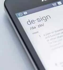
What Is Responsive Web Design?
In simple terms, responsive web design is a type of design that is created to scale up or down to fit a variety of screen sizes. Those screen sizes include smartphones, tablet devices, laptops, and desktop computers. Normally, a responsive website’s text, images, buttons, and navigation all expand and contract to the size of the device’s screen size.
A responsive website is:
- Easier to read because the font size is large enough to read even on phones.
- Only going to vertically scroll. It’s not going to have horizontal scroll where there is text and images displaying off to the side of the screen.
- Favored by search engines like Google
Why is responsiveness such a big thing now? That's because more and more people are using their smart phones and tablets to surf the internet. So it's become the new best practice in web design that’s officially here to stay.

Why Switching To A Responsive Design Is Important
Responsive website designs come with many benefits but there are three big reasons why it is important for you as a business owner.
63% Of Google Searches Were Done Via Mobile Devices.
(Statista, July 2019)
1) SEO Benefits
If your website is responsive, you will rank better in search engine results.
In April 2015, Google officially configured it’s search algorithm to count responsiveness as a ranking factor. This update affects all sites that want to be found in organic searches.
2) User-Friendliness
In comparison to a non-responsive website, a responsive site is more user friendly and less frustrating to view on a small device like a smartphone.
The user doesn’t have to zoom in and out to read your text because the font size will automatically scale to the right size to be readable. Photos will load as a smaller size so that they are easier to see.
3) Less Maintenance
A responsive template saves you time compared to it’s alternatives. For example, one alternative to a responsive site is to create a desktop and mobile version of each page on your website. That means if you have 10 pages of content you will have a total of 20 pages to update (10 for desktop + 10 for mobile). That means it requires more time to create new pages and make edits to your site because everything you do, you have to do it twice.
On the other hand, when you create pages with responsive template or theme, you only have to create and edit one page that works for all devices.
Time To Make A Change
As you can see, if you haven’t jumped on board and made your website responsive, you have three great reasons to do so. For your business website or blog to be successful, it must be responsive.
Search This Site
Recent Articles
-
Premium Flyer Templates Now $8.99
Apr 03, 26 12:00 AM
Need a flyer for your lawn care, handyman or babysitting business? Premium flyer templates are now $8.99 or you can by the bundle for only $19.99. -
What Makes A Good Website - Elevate Your Site Above The Competition
May 20, 23 09:21 PM
 A good website is not just about the design. It's a combination of 4 key elements that must be skillfully implemented.
 -
Ways to Create Unique Business Cards
Jan 07, 23 06:06 PM
Having unique business cards is definitely a way to make your business stand out of the crowd. Here are some ways to transform your business cards into one-of-a-kind.
Recent Articles
-
Premium Flyer Templates Now $8.99
Apr 03, 26 12:00 AM
Need a flyer for your lawn care, handyman or babysitting business? Premium flyer templates are now $8.99 or you can by the bundle for only $19.99. -
What Makes A Good Website - Elevate Your Site Above The Competition
May 20, 23 09:21 PM
A good website is not just about the design. It's a combination of 4 key elements that must be skillfully implemented. -
Ways to Create Unique Business Cards
Jan 07, 23 06:06 PM
Having unique business cards is definitely a way to make your business stand out of the crowd. Here are some ways to transform your business cards into one-of-a-kind.