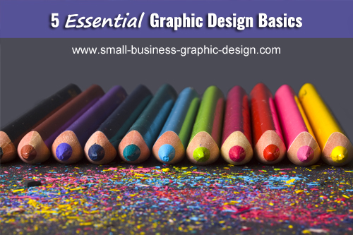
5 Essential Graphic Design Basics
Keep in mind these five graphic design basics for any marketing materials created for your small business.
Here's a fun fact: These five basics I discuss below are the first 5 things I learned when I studied print design.
With these graphic design principles, you can create well designed layouts.
Think of these principles as pieces to a puzzle. If you're missing one then the whole image is incomplete and you're left wondering what the big picture is.
The list below is solely for coming up with a good layout.
In order for your material to work for your business, you need to combine these graphic design basics with the skills of communication. You do not want to lose communication in your design.
The Five Graphic Design Basics
- Rhythm
This deals with how the reader's eye moves across the layout of a page. Usually, the eye follows a pattern of reading left to right and top to bottom. When designing, if you have an important piece of information you want to place it in the top left hand corner where the eye is likely to look first if anywhere. - Balance
When designing a layout, you want there to be a sense of equality among the elements in your design and the overall feel. There are two ways things can be balanced: Formally and Informally. Things that are designed informally depends greatly on what type of business you have but, for the most part flyers are balanced informally compared to invites or a greeting card. - Proportion
It is all about sizing, and keeping things in its natural size. By simply holding down the shift key you keep a picture from being skewed. Also, proportion can be applied to fonts. You want to make sure that your headline or title sticks out more than the common text. - Unity
It's based on how the page looks as a whole. All pieces should work together and cooperate with the message you are presenting. One rule of thumb is not to use more than three fonts because it can make a design look scattered and disorderly. - Contrast
Contrast can be likened to variety. Contrast makes elements in your page stick out and interact with each other. To create variety try changing your fonts, reverse imaging and colors. Use colors that stand out on important elements you want to pop and use subtle colors on elements you want to take second place to the most important. That way everything is not fighting for attention.
Search This Site
Recent Articles
-
Premium Flyer Templates Now $8.99
Apr 03, 26 12:00 AM
Need a flyer for your lawn care, handyman or babysitting business? Premium flyer templates are now $8.99 or you can by the bundle for only $19.99. -
What Makes A Good Website - Elevate Your Site Above The Competition
May 20, 23 09:21 PM
 A good website is not just about the design. It's a combination of 4 key elements that must be skillfully implemented.
 -
Ways to Create Unique Business Cards
Jan 07, 23 06:06 PM
Having unique business cards is definitely a way to make your business stand out of the crowd. Here are some ways to transform your business cards into one-of-a-kind.
Recent Articles
-
Premium Flyer Templates Now $8.99
Apr 03, 26 12:00 AM
Need a flyer for your lawn care, handyman or babysitting business? Premium flyer templates are now $8.99 or you can by the bundle for only $19.99. -
What Makes A Good Website - Elevate Your Site Above The Competition
May 20, 23 09:21 PM
A good website is not just about the design. It's a combination of 4 key elements that must be skillfully implemented. -
Ways to Create Unique Business Cards
Jan 07, 23 06:06 PM
Having unique business cards is definitely a way to make your business stand out of the crowd. Here are some ways to transform your business cards into one-of-a-kind.