Using the Color Wheel in Design
Everyone is mostly familiar with the fabulous color wheel. It's the basic tool for matching colors and creating basic schemes. You can consider it as either the first or second step to finding the right colors (hues) for your business’ graphic design and print needs.
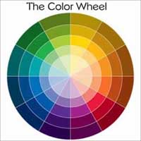
When you are at the point where you are ready to pick a scheme for marketing materials you can refer to the color wheel to find hues that work well with the base color of your business.
"It is important to put a lot of thought into your business’ color scheme because it creates style and impacts the way others look at your business."
The base color can be one or two colors that are usually associated with your field of business. For example your base color may be a calming blue or green hue if you are a spa business because those hues are what’s usually associated with the particular field. If you are in construction you may consider basing your scheme around reds which are related to bricks or grays which are like concrete or machinery.
There are so many combinations or schemes that can be made using the basic wheel. Here is a list of common color schemes.
-
Monochrome
This scheme uses one color and various tints and shades of it. A monochromatic scheme can be used to easily achieve unity and harmony in a design. It also can convey consistency or stability. Salmon pink, hot pink, and rose pink are monochromatic colors. - Analogous
This scheme is achieved by using hues that are next to each other. It can be a combination of two, three, or four colors. Use analogous colors if you want to go for a scheme that is simple and orderly. Bright yellow, lime green, and sky blue are analogous colors. - Complimentary
This is a combination consisting of two colors and is accomplished by using colors opposite or across from each other. Complimentary color schemes, in a sense, can be a display of balance between two opposite colors (harmony) or a vibrant struggle between two different colors to pop and stand out (discord). Though a strong combination, when complimentary colors are mixed or overlapped they can neutralize or diffuse each other. Plum purple and carroty orange compliment each other very well. - Split Complimentary
This is a three color scheme using a color and the two hues next to the compliment of it. This scheme is a great combination to use to seem a little less basic and more complex. - Triad
These colors are equally spread out on the wheel. One well known triad scheme is the combination of red, yellow, and blue.
Be Creative: Spin the Color Wheel
Once you are very skilled at color combinations you don’t have to stick to just these color schemes because there are so many more combinations to try. Don’t be afraid to spin the wheel and combine color schemes not defined by book.
Back to Color Theory and the Color Wheel
Color Theory and the Color Wheel Return to Top
Search This Site
Recent Articles
-
Premium Flyer Templates Now $8.99
Apr 03, 26 12:00 AM
Need a flyer for your lawn care, handyman or babysitting business? Premium flyer templates are now $8.99 or you can by the bundle for only $19.99. -
What Makes A Good Website - Elevate Your Site Above The Competition
May 20, 23 09:21 PM
 A good website is not just about the design. It's a combination of 4 key elements that must be skillfully implemented.
 -
Ways to Create Unique Business Cards
Jan 07, 23 06:06 PM
Having unique business cards is definitely a way to make your business stand out of the crowd. Here are some ways to transform your business cards into one-of-a-kind.
Recent Articles
-
Premium Flyer Templates Now $8.99
Apr 03, 26 12:00 AM
Need a flyer for your lawn care, handyman or babysitting business? Premium flyer templates are now $8.99 or you can by the bundle for only $19.99. -
What Makes A Good Website - Elevate Your Site Above The Competition
May 20, 23 09:21 PM
A good website is not just about the design. It's a combination of 4 key elements that must be skillfully implemented. -
Ways to Create Unique Business Cards
Jan 07, 23 06:06 PM
Having unique business cards is definitely a way to make your business stand out of the crowd. Here are some ways to transform your business cards into one-of-a-kind.